Trade Alert – First Solar gets too bright as inflation burns


First solar is up big again today, hitting new recent highs and I am going to go ahead and trim a little bit here, about 1/5 of my overall position (see: First Solar is back and tradable).
Juniper’s up big today and is now up nearly 10% from our recent big tranche buy level. I am holding that one steady (see: Another key infrastructure investment).
Markets continue to act jiggy and there’s little resistance to the “risk-on” trade continuing for now. “Risk on” means that the long-term artificially low 0% interest rate environment is, as we’ve discussed before, forcing people to pull their money from safer places like CDs and Treasuries and putting that money into riskier assets like stocks (see: Stocks Poised For More New Highs).
Intel, is, right here right now even after rallying 20% recently, yielding nearly three times as much as 10 year Treasuries are (see: Intel a Value Trap?).
And speaking Treasuries, can you believe that they are setting all-time new highs again, meaning that they are yielding all-time new lows again today? Here’s a chart of the entire history of the US 10 year Treasury going back all the way to 1790, courtesy of the Fed, BofA and Bloomberg:
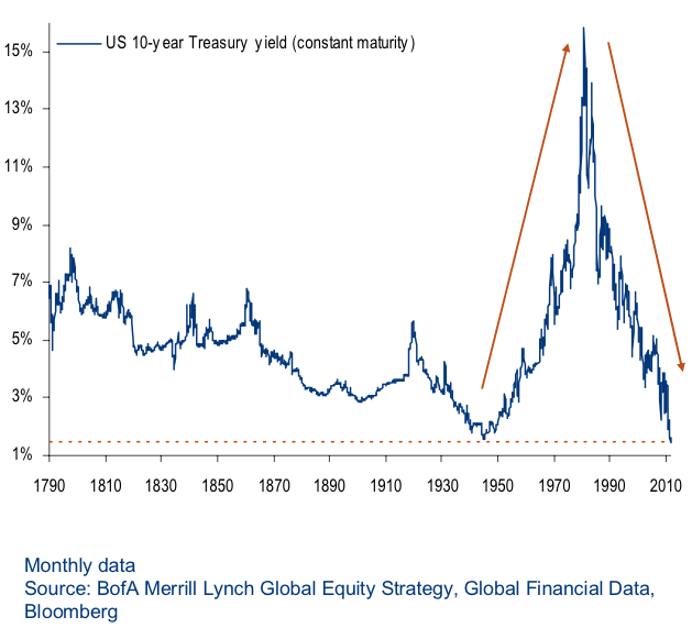
Could the yield go even lower? Yes, a little bit. Could the yield go negative? Yes, but that would likely indicate a horrendous economic and market crash on the horizon. Could the yield stay down here near unprecedented historic lows for a years? Yes, and the Republican/Democrat Regime and the Federal Reserve will do everything they can to make that happen. Including continue savers and retirees into higher-risk assets and inflating more asset bubbles, continuing the playbook as I’ve outlined for us many times in the past few years (see: Search Marketwatch “Cody Bubble”).
What would likely be the catalyst to make yields go up? Debt crisis. War between two big economies. Unforeseen consequences of the ongoing and escalating currency wars. And inflation. (see: Indicator Update: Interpreting Mixed Signals)
Speaking of inflation, do you believe this chart?
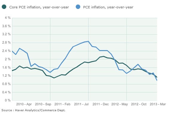
Or, is it, as I think it is, a case of junk-in-junk-out? (See: The chart that explains why the Fed is on hold this week.)
I created a poll to get some idea as to how realistic that chart is to our readership, so please kick here and help us get a sizeable sample and I’ll report the results back in a column next week.